Throughout the hundreds of hours I spent meeting with customers, sales teams, and internal users of Prisma Cloud, I was struck by the complexity of feedback I received. Soon into the process, a few key themes emerged. Each theme centered on the user experience of the product.
Motivated by a desire to enhance usability, I embarked on a journey to better understand our users and their needs. To offer some insight into the approach, user experience teams and myself employed various UX methods to transform our application.
The Process: From Users to Co-Creators
Step 1: Deep-Dive User Interviews
I started by reaching out to our users for one-on-one interviews. These weren't mere formalities. We had heartfelt conversations where I genuinely wanted to understand their struggles and aspirations with our product. The stories I heard were eye-opening. They spoke of the challenges they faced and the features they wished they had. I came away from the conversations with a clear picture of the emotional and functional needs of our users.
Step 2: Broadening the Horizon with Surveys
To complement the depth of the interviews, I rolled out surveys to a wider user base. The responses flooded in, providing a broader perspective on common issues and desired features. I was beginning to see patterns and areas where we could make the most impact.
Step 3: Hands-On Usability Testing
Armed with user input, I organized usability testing sessions. Watching real users navigate our application was a revelation. I could see where they hesitated, where they got stuck, and where our security protocols felt more like obstacles than safeguards.
Step 4: Establishing Continuous Feedback
I realized that to make lasting change, I needed ongoing input. I chose to champion the integration of feedback mechanisms within our application. This allows users to share their thoughts in real-time, ensuring we stay on the pulse of their needs.
Step 5: Diving into Data Analytics
Beyond the stories and feedback, I dove into the world of data analytics. Every click, every interaction offered a trove of information. Quantitative data, combined with the qualitative insights from earlier, painted a comprehensive picture of our user experience.
This helps to cut through noise and focus on important issues.
Embracing Iterative Design
With all this knowledge, I spearheaded an iterative design approach. Every change, every tweak was tested and validated with our users. We were no longer shooting in the dark. We were now co-creating with our users.
A prime example of the outcomes of these methods is our new Persona Switcher. The Persona Switcher enables easy navigation to customizations that better address the needs of security professionals working in specific areas. By providing a personalized experience, it empowers them to efficiently manage the tasks most relevant to their roles and responsibilities, ultimately enhancing their overall workflow and productivity.
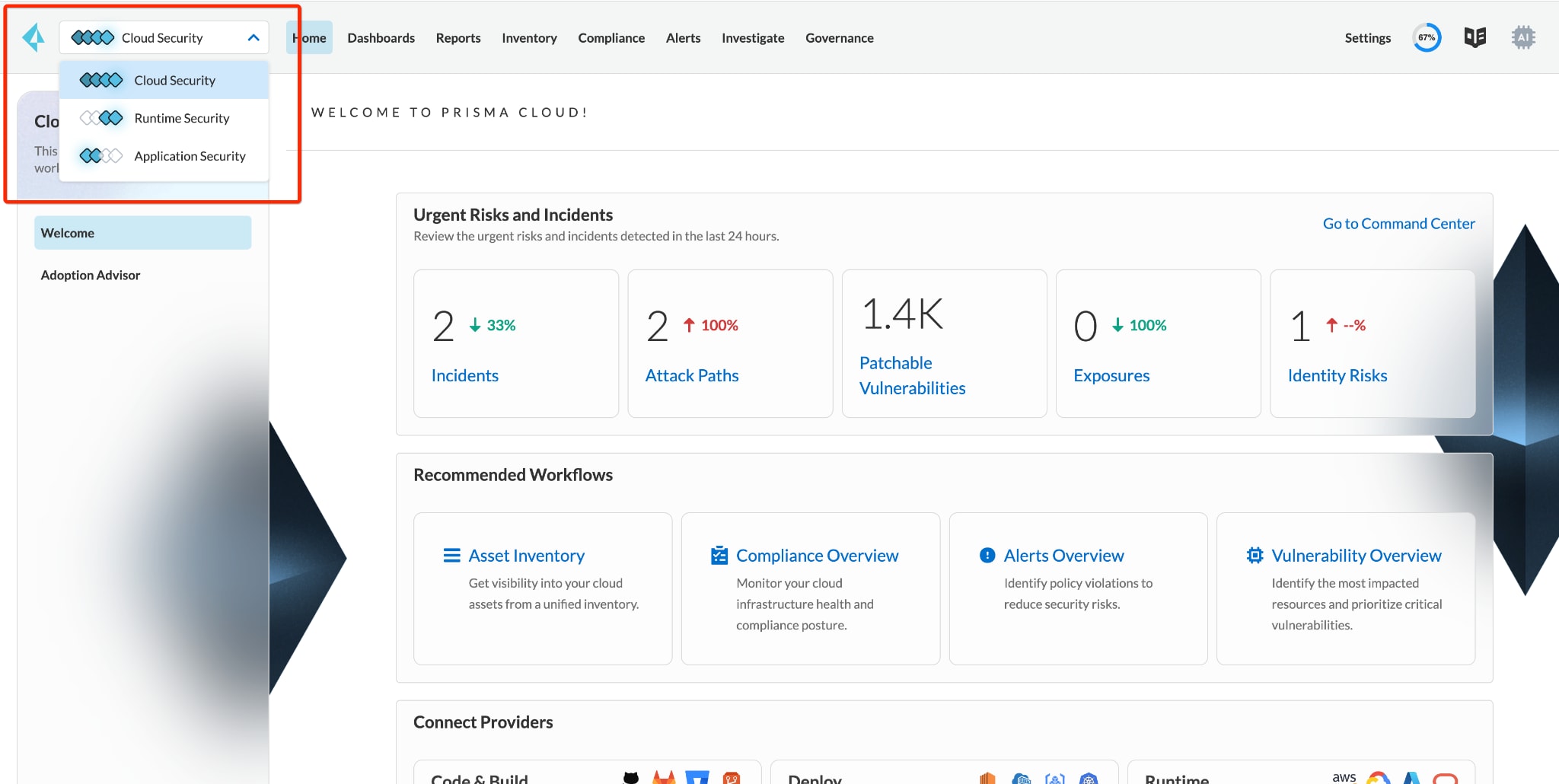
With our process, we collected the common denominators of all the capabilities we’ve developed over the years. Examining these, we found that to create a platform that could truly meet the needs of diverse security teams, we needed to tightly couple and loosely align the capabilities of the platform. This was the key decision behind how we created our platform-level top navigation while still allowing autonomy to meet custom Cloud Security, Runtime Security and App Security workflows on the left navigation.
Layering Transparent Elements
The hundreds of hours invested in seeking out and listening to our users provided insights that factored into numerous aspects of Palo Alto Networks recent Darwin release of Prisma Cloud. One technique applied throughout — layering transparent elements — merits a brief mention.
Streamlining Clarity in Complex Environments
In the continuous enhancement of Prisma Cloud, we prioritize clarity amidst the complexity of cloud security. Our interface has been meticulously designed to guide security professionals through their infrastructure with ease.
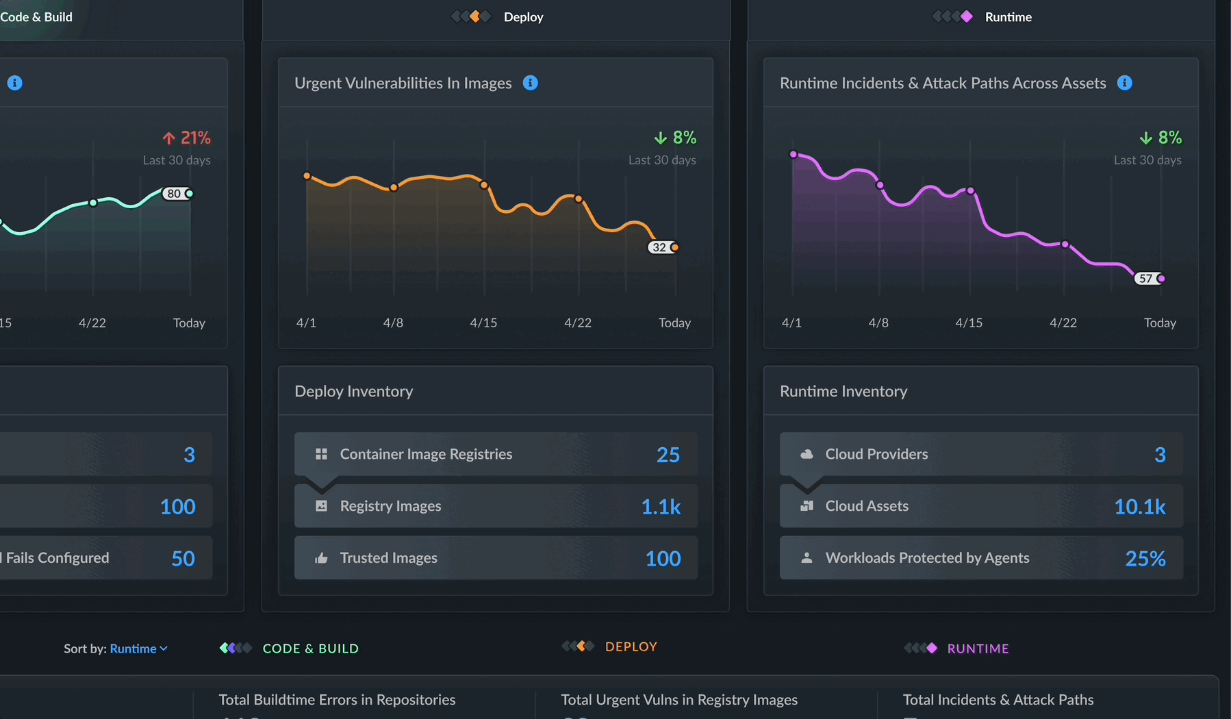
By strategically organizing information, we ensure that critical issues stand out, allowing for swift identification and action. This clarity of presentation means that potential security misconfigurations and vulnerabilities aren’t lost in the noise. In fact, as one cloud security architect pointed out after a preview of our graphing elements, “This helps to cut through noise and focus on important issues.”
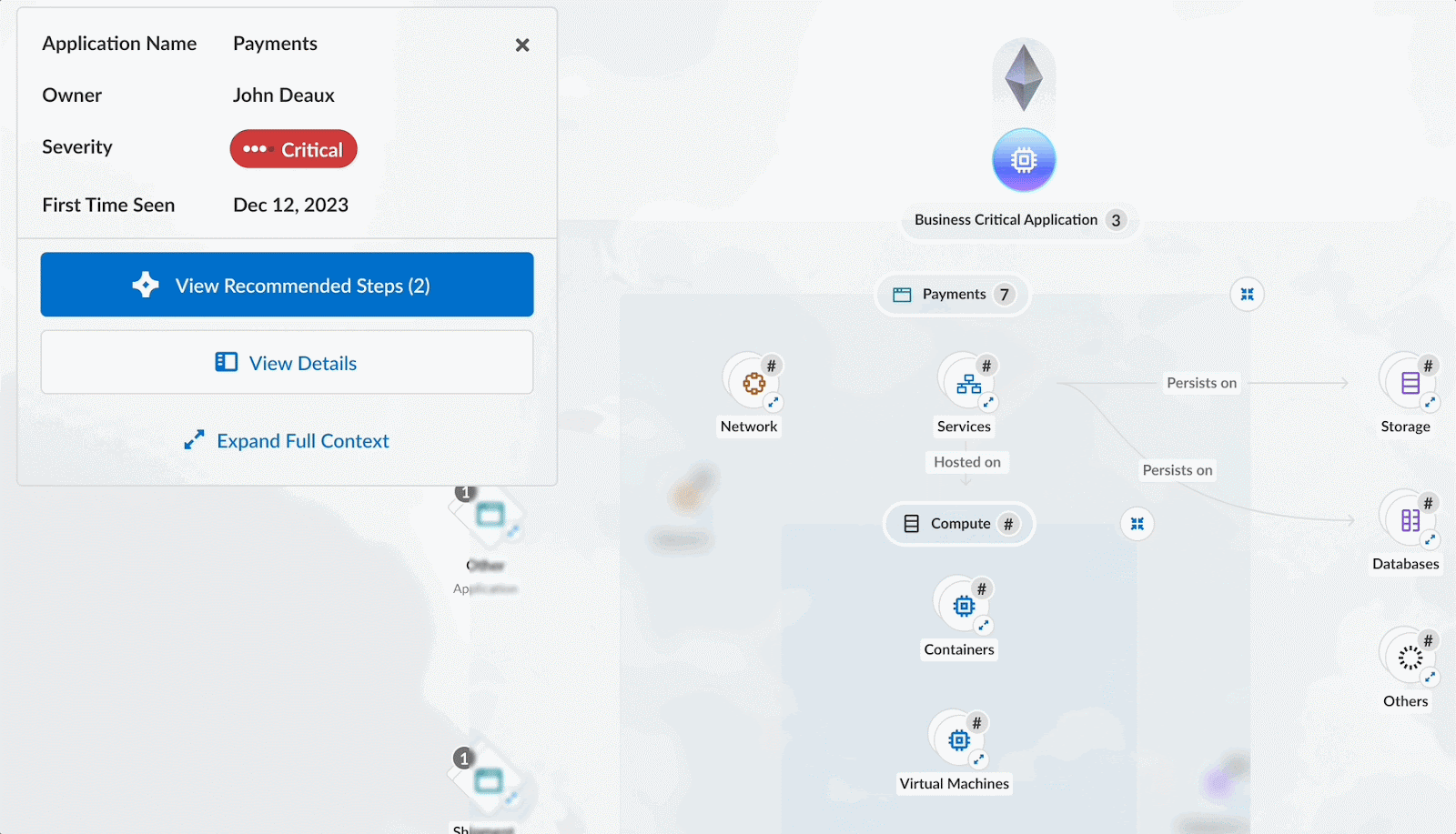
Translucent overlays, as seen in figure 2, reveal insights. Network traffic flows and build pipelines can be shown with pulsing red pipes and links spanning the environment. As anomalies or threats are detected, the transparency allows users to view the underlying infrastructure impacted by suspicious data flows. Alert badges hovering over compromised components indicate problems without fully obstructing the view.
Layering transparent elements effectively displays multiple data dimensions. By floating user behavior profiles, risk scores, and other analytics readouts transparently over relevant environments and assets, the underlying model remains clear. This visual hierarchy lets users focus on insights while maintaining perspective.
Prioritizing Actionable Insights
Our approach to data presentation is straightforward: prioritize actionable insights. We've structured our interface to present security metrics and alerts in a way that doesn't overwhelm but empowers. Security teams can now navigate through alerts and insights without losing sight of the broader security landscape. This streamlined presentation of data ensures that the most pertinent information is always at the forefront, enabling security professionals to make informed decisions quickly and confidently.
Our goal behind using transparent overlays centers on providing a visual experience that moves from the hidden to the seen, obscurity to clarity. As Prisma Cloud promises to shine a light into the shadows of the cloud attack surface, the UI purposely serves that intention.
Designing for the Future
Imagine a world where users aren’t forced to sift through a labyrinth of data points to understand issues. With Prisma Cloud, the user interface (UI) plays a key role in representing visibility into the user's infrastructure, applications and data flows.
As we continue to evolve and expand our capabilities with the aim of providing greater transparency and insight into cloud environments, we will utilize the methods detailed in this post — and more — to create feature-rich and tailored workflows that directly address the needs of our users. Our commitment to user-centric design ensures that we consistently strive for innovation and improvement, empowering our users with a solution that not only meets but exceeds their expectations in the ever-changing landscape of cloud security.
Learn More
To learn about Prisma Cloud's latest innovations, tune in to our on-demand virtual event, CNAPP Supercharged: A Radically New Approach to Cloud Security, where we’ll show you how to streamline app lifecycle protection.
And if you haven’t tried Prisma Cloud, take it for a test drive with a free 30-day Prisma Cloud trial.