The real Kubernetes security problem is knowing where to start
Most Kubernetes security tools excel at one thing: overwhelming your team with data. They surface thousands of vulnerabilities, malware findings, and open alerts through a visually appealing dashboard. Although the data is accurate, it does not tell you where to begin your remediation efforts.
In Kubernetes, raw counts of vulnerabilities, secrets, and compliance issues do not tell the whole story. A cluster does not behave like a standard VM or a single container. Instead, a cluster is a stack of nested environments. Namespaces sit inside it. Applications run based on runtime images inside those namespaces. Workloads stand those images up, update them, and replace them. Thousands of relationships run through all of it, and the risk lives in those connections rather than in any single object. A static list only shows you what is broken; it cannot show you how those broken pieces connect or which ones actually matter.
The question worth answering isn’t how many misconfigurations you have. It is determining exactly which clusters, namespaces, and workloads put your environment at risk, and why.
Meet KSPM Graph
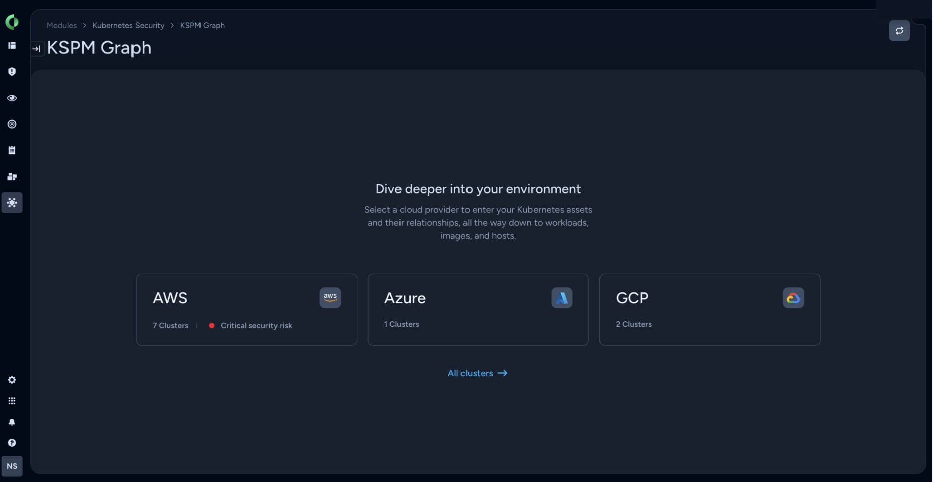
KSPM Graph is a visual map of your Kubernetes environment built into Cortex Cloud. We designed it to prioritize security risks using an interactive interface, without requiring you to write complex queries or deeply understand the underlying data model. This view starts with your cloud providers and lets you drill straight down into clusters, namespaces, workloads, and runtime images. The security context automatically accounts for associated vulnerabilities, misconfigurations, malware, secrets, and internet exposure. You see the full context of a risky Kubernetes resource immediately.
It solves the primary problem of knowing where to begin. By prioritizing risks visually, you can see exactly which clusters and workloads to focus on and trace the specific issues that require attention. KSPM Graph is built for DevOps, platform engineers, security analysts, security architects, and anyone responsible for securing Kubernetes estates.
Beyond Queries and Static Lists
There are two primary ways to surface risk in Kubernetes.
The first relies on a question you already have. For example: "Show me clusters with workloads that run a vulnerable image, above a high severity, matching the application’s name." Because you know what you are hunting for, you write a query, and the search returns the matches. This is Graph Search. It is precise, repeatable, and scales across findings. However, it requires you to know the data model and phrase the query perfectly. It pays off heavily, but only when you already know what you are looking for.
The second way is to assess risk without a specific starting question. You need to walk through your entire estate and figure out what requires immediate attention. This is the difference between querying a data model and using a visual map. The query approach is like standing outside your house and asking if the back window is locked. The visual map approach is walking in the front door because you smell smoke. You do not need to know the smoke is coming from the kitchen right away. You see the haze, you follow it, and you find the burning pan. Both methods have value, but when assessing overall risk, a visual map lets you follow the smoke immediately and get to the risk faster.
How KSPM Graph Works
Prioritize the riskiest assets
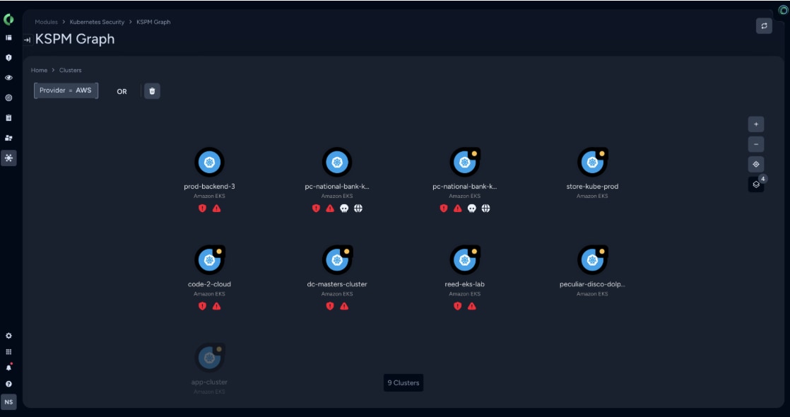
When you open KSPM Graph, you land at the top of your environment: cloud providers first, then their clusters, laid out as a map rather than a table.
The clusters are automatically prioritized by risk. The riskiest cluster sits in the top left, ranked by aggregated findings across internet exposure, malware, vulnerabilities, secrets, misconfigurations, and additional security issues. Icons flag immediate context at a glance, a globe for internet exposure, and a skull for malware. It also highlights unprotected clusters, helping you identify blind spots across your entire cloud footprint.
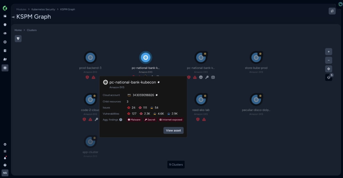
Hovering over a cluster reveals its posture summary: the split between critical and high-risk issues, vulnerability totals, and specific flags. In one mouse movement, you know which cluster needs remediation. Contrast this with a traditional investigation, where locating the highest risk requires dozens of clicks through nested tabs.
Drill in and investigate
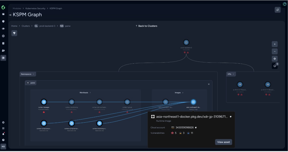
Clicking into a cluster reveals its internal structure, instantly highlighting the specific namespace demanding your focus. The investigation flows naturally downward, mapping the relationship between the workload layer and the underlying runtime images. Because every layer is risk-prioritized, you are guided directly toward the most critical threats without losing your navigational context.
Selecting an asset opens its card, displaying vulnerabilities, misconfigurations, identity details, and environmental connections. You can open multiple asset cards as stacked tabs for deeper cross-referencing. When finished, simply close them to return to your exact place in the graph.
Fix the risk at its source
KSPM Graph separates risk into two distinct levels: what is in the workload and what is in the image.
- Workload-level risk concerns how that workload runs and its exposure, such as a workload being directly reachable from the public internet.
- Image-level risk involves what is baked in, such as vulnerable packages and known CVEs.
These are different problems requiring different fixes. You can patch every CVE in an image, but if the workload exposes it to the internet, you remain at risk.
With clear visibility into both, KSPM Graph provides recommendations for fixing the root cause rather than chasing symptoms. If the source is the image, you update the image. If the source is the workload, you fix the workload configuration, and every image running under it immediately stops carrying that exposure risk. By adding the Kubernetes orchestration layer to the visual context, teams can stop repeatedly patching the same images and start optimizing their remediation strategy.
Simplifying Kubernetes Security with Cortex Cloud
Kubernetes is a highly complex infrastructure. The standard industry reflex has been to add more data, more dashboards, and more reports. A more effective approach is to prioritize risks in a visual graph, enabling teams to focus immediately on critical issues rather than searching for them.
Kubernetes security has traditionally carried a heavy operational tax. To get value, teams had to learn complex data models, memorize query languages, and sift through static lists. We are removing that tax with KSPM Graph by turning posture management into a visual, graphical navigation for risk prioritization. This answers the simple problem of where to start, your teams can load the graph, immediately spot the riskiest assets in a sprawling multi-cloud environment, and focus on the security concerns that matter.
For existing customers, this capability is included in C1 and C3 cloud security licenses. Take a demo today to uncover what's hidden in your builds.